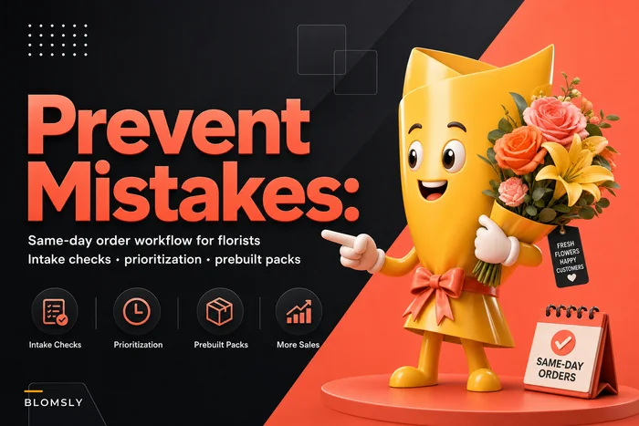

Your product pages are probably sabotaging conversions without you knowing it. The difference between a 2% and an 8% conversion rate on the exact same bouquet often comes down to how you present it based on the occasion. A pink rose arrangement photographed against white backdrop with soft copy converts terribly for Valentine's Day but crushes it for Mother's Day.
Most florists stick with the same generic template for every product: hero photo, price, description, add to cart. But customers shopping for sympathy flowers have completely different emotional triggers than someone ordering birthday arrangements. They scan for different visual cues, respond to different copy, and care about different delivery options.
The pattern becomes clear once you start tracking. Birthday arrangements need energy and celebration signals. Sympathy pieces need quiet elegance and reliability cues. Anniversary flowers need romance without being cheesy. Get the occasion wrong, and that beautiful $89 arrangement sits there getting views but no orders.
Birthday arrangements need party energy, not funeral home vibes
Birthday product pages convert when they feel celebratory from the first pixel. The hero photo should show the arrangement in context—on a table with wrapped gifts, next to balloons, or being handed to someone smiling. Static vase-on-white-background shots kill the mood instantly.
Your copy needs to match that energy. Instead of "Beautiful mixed seasonal blooms arranged in a glass vase," try "The surprise that makes them do the happy dance—bright blooms that scream celebration." Price anchoring works differently too. Birthday shoppers often upgrade when you show a "good-better-best" structure side by side, especially when the middle option is labeled "most popular for birthdays."
Same-day delivery for birthdays should be prominently featured with language like "Forgot? We've got you covered—order by 2pm for today!" But scheduled delivery needs equal weight because many customers plan ahead for milestone birthdays.
-
Hero shot
arrangement in celebration context (party table, gift setting)
-
Detail shot
close-up of feature flowers showing vibrancy
-
Scale shot
arrangement next to common object for size reference
-
Delivery shot
driver with arrangement and smile (builds trust for last-minute orders)
-
Alternative angle
360-degree view or multiple angles
The conversion difference is dramatic. A Portland shop I worked with switched their birthday collection from standard product shots to celebration-context photos. Their birthday page conversions jumped from around 3% to nearly 6% over two months. Same flowers, same prices, but suddenly people were actually buying instead of just browsing.
Sympathy arrangements require subtle dignity signals
Sympathy product pages fail when they try too hard. The biggest mistake is using overly dramatic or sad imagery. Customers shopping for funeral flowers are already emotional—they need calm, professional presentation that respects the moment without amplifying grief.
Never miss a bloom or a delivery.
Blomsly helps you manage orders, track stock, and schedule deliveries effortlessly.
- Unified order management
- Real-time inventory tracking
- Delivery scheduling & notifications
No credit card required
Your hero photo should show the arrangement in soft, natural light against a neutral background. Not stark white (too clinical) or deep black (too heavy), but warm gray or soft beige. The arrangement should look substantial and well-crafted without being ostentatious. Skip the artistic angles—straightforward presentation builds trust during difficult decisions.
Copy for sympathy pages needs restraint. Avoid flowery language or trying to express condolences through product description. Focus on practical details: "Elegant white lilies and roses arranged in a traditional standing spray, appropriate for funeral service display. Available for delivery directly to funeral homes throughout the area."
-
Trust badges near checkout (satisfaction guarantee, local florist certification)
-
Clear funeral home delivery information
-
Discrete pricing (no bold red sale tags)
-
Professional photography without models or contexts
-
Simple color options (white, soft pink, mixed pastels)
Emphasize "Guaranteed delivery to service" over "Rush delivery available!" The psychological difference matters—bereaved customers need certainty, not pressure.
A Toledo shop I helped restructured their sympathy pages following these principles. Cart abandonment for their sympathy products dropped from around 68% to roughly 42% over three months. The key change wasn't the flowers or prices—it was removing anxiety from the purchase process through better presentation.
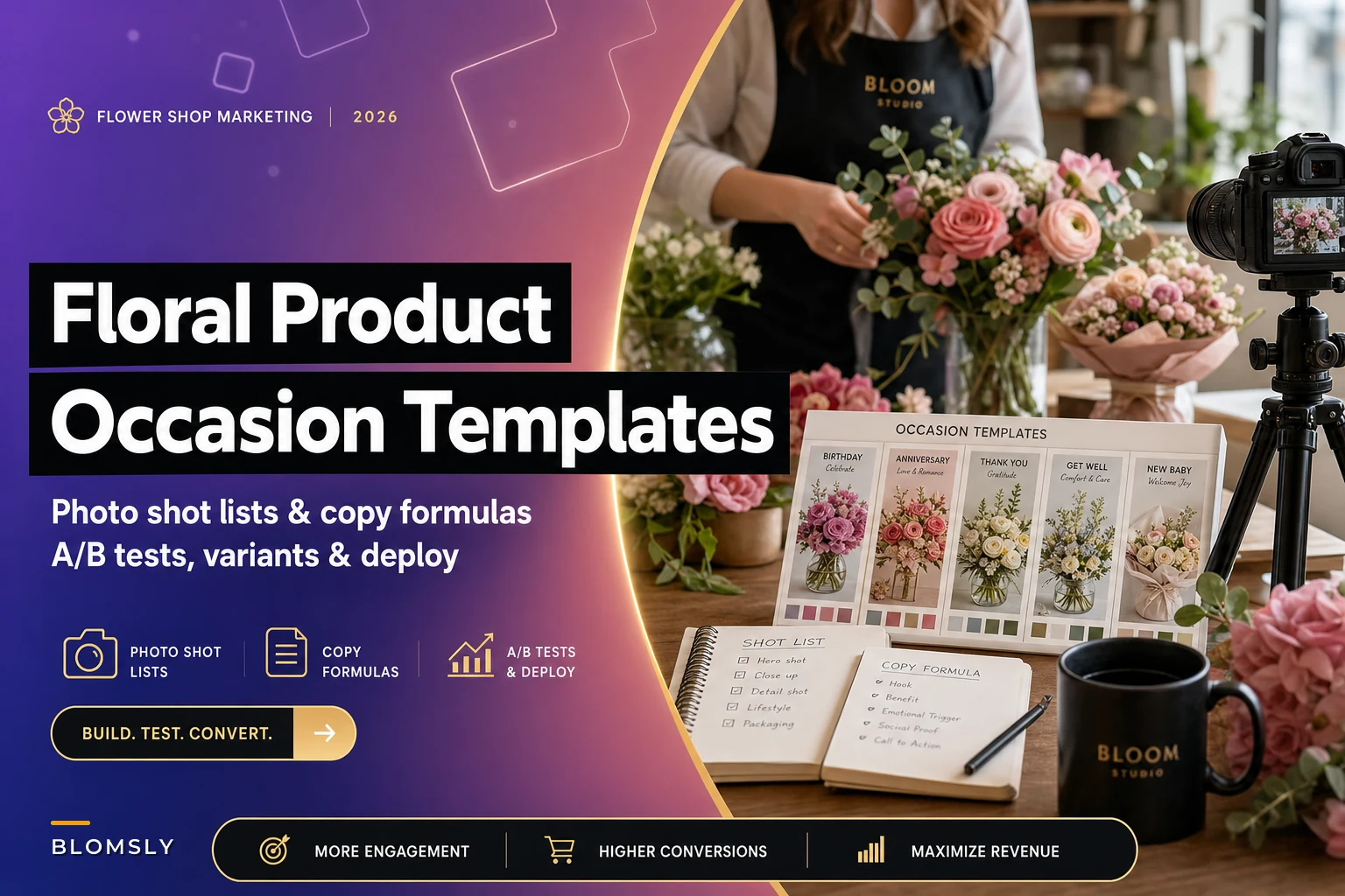
The photo shot list that actually drives purchases
Generic flower photos are conversion killers. Every occasion needs specific visual proof points that address customer anxieties.
Primary hero shot checklist:
-
Lighting
Natural or soft artificial, no harsh shadows
-
Background
Occasion-appropriate (festive for birthdays, neutral for sympathy)
-
Angle
Eye-level for most occasions, slightly elevated for larger arrangements
-
Props
Minimal but purposeful (ribbon for gift, card for sympathy)
-
Focus
Sharp on focal flowers, soft background blur
Secondary shots that boost conversion:
-
Size reference
Arrangement next to wine bottle, book, or ruler
-
Texture detail
Close-up showing flower quality and freshness
-
Color accuracy
Multiple lighting conditions if selling online
-
Packaging
How it looks when delivered (especially for gifts)
-
Longevity shot
"Day 1 vs Day 5" comparison for premium arrangements
Most shops shoot everything the same way, but a $35 seasonal mixed bouquet needs different visual proof than a $200 premium rose arrangement. Budget shoppers want to see value and fullness. Premium buyers want to see individual flower perfection and sophisticated design.
During Valentine's week, I tested this with one client. Same Valentine's arrangement with two photo sets. Version A used standard white-background product shots. Version B used romantic context shots with soft lighting and gift packaging visible. Version B converted at around 11% versus 7% for Version A. People could actually picture giving the flowers as a gift.
Copy formulas tied to emotional buying triggers
Different occasions trigger different emotional states, and your copy needs to match. Birthday shoppers buy joy. Sympathy shoppers buy comfort. Anniversary shoppers buy romance. Get the emotional tone wrong and conversions tank.
Birthday copy structure:
-
Lead with excitement
"The gift that gets the biggest smile"
-
Feature benefit
"Bright gerberas and sunflowers that last up to 10 days"
-
Social proof
"Our #1 birthday seller three years running"
-
Urgency
"Order by 2pm for same-day birthday surprise"
Sympathy copy structure:
-
Lead with respect
"A thoughtful expression of sympathy"
-
Practical details
"Appropriate for service or home delivery"
-
Trust building
"Handled with care by our experienced team"
-
Reassurance
"Guaranteed timely delivery to all local funeral homes"
Anniversary copy structure:
-
Lead with romance
"Say it better than words ever could"
-
Personal touch
"Add their favorite flowers for extra meaning"
-
Quality emphasis
"Premium roses selected for perfect blooms"
-
Occasion reminder
"Don't let another year pass without showing them"
The conversion impact of matched copy is measurable. Generic descriptions like "beautiful flower arrangement" convert at roughly 2-3%. Occasion-specific copy with emotional triggers converts at 5-7%. The difference compounds across your entire catalog.
Same-day versus scheduled delivery page structures
The delivery promise fundamentally changes how customers evaluate your product pages. Same-day shoppers are solving an urgent problem. Scheduled delivery buyers are planning an experience. Your page structure needs to reflect this difference.
Same-day optimized structure:
-
Delivery promise in hero area
"Order by 2pm for delivery today"
-
Limited selection
Show only actually available inventory
-
Trust signals
Local florist badge, delivery area map
-
Simplified options
Remove complex customization
-
Express checkout
One-page checkout, stored payment options
-
Real-time updates
"Only 3 left for today's delivery"
Scheduled delivery optimized structure:
-
Date selector prominent
Calendar widget above fold
-
Full catalog
Show everything available for chosen date
-
Customization options
Add-ons, vase upgrades, card options
-
Reminder setup
"We'll email you day before delivery"
-
Standard checkout
Full billing/delivery separation
-
Advance benefits
"Order early and save 10%"
This split approach seems like extra work, but the conversion difference justifies it. A Worcester shop separated their same-day and scheduled options into different page templates. Same-day conversions improved by roughly 35% because urgent shoppers no longer got distracted by irrelevant options.
Testing that actually moves revenue
Most shops test the wrong things—button colors, font sizes, meaningless tweaks. Tests that actually impact revenue focus on core elements:
| Test Type | Control | Variant | Typical Lift |
|---|---|---|---|
| Occasion-specific hero images | Standard product shot on white | Occasion-context shot | 20-35% conversion improvement |
| Delivery promise placement | Delivery info in product description | Delivery promise badge next to price | 12-18% for same-day shoppers |
| Social proof format | Star ratings only | Recent purchase feed | 8-12% overall, 15%+ for new visitors |
| Price presentation | Single price point | Three-tier sizing | 15% increase in average order value |
| Urgency messaging by occasion | Generic "Order soon" | Occasion-specific urgency | 25%+ during peak periods |
Run one clear test for two weeks, implement the winner, then test the next element. Most shops try testing everything at once and learn nothing.
Sample page structures that consistently convert
Birthday arrangement page flow:
-
Hero
Bright arrangement with birthday context, "Same-day available" badge
-
Headline
"Make Their Birthday Unforgettable"
-
Price tiers
Three options visible immediately
-
Occasion prompt
"Tell us about the birthday person" (triggers personalization)
-
Delivery selector
Same-day prominent, scheduled available
-
Social proof
Recent birthday orders ticker
-
Add-ons
Balloons, chocolates, teddy bears carousel
-
Guarantee
"Love it or your money back" with birthday-specific language
Sympathy arrangement page flow:
-
Hero
Elegant arrangement, muted colors, professional photo
-
Headline
"Express Your Condolences with Grace"
-
Single price
Clear, no promotional language
-
Delivery info
"Funeral home delivery available" upfront
-
Card message
Expanded field with sympathy message suggestions
-
Trust elements
Local florist certification, testimonials
-
Service options
Standing spray, casket spray, family home
-
Assurance
"Handled with dignity and care"
The structural differences seem minor but drive major conversion improvements. Birthday pages that immediately show price tiers convert better because gift-givers often stretch budgets for celebrations.
Common mistakes that kill conversions
Even experienced florists make these conversion-killing mistakes on their product pages:
Using the same template for all occasions. A red rose page for Valentine's Day needs different elements than the same roses for an anniversary. The photos, copy, urgency messaging, and trust signals all need occasion-specific optimization.
Hiding delivery information until checkout. Customers abandon carts when surprised by delivery limitations. Show delivery options, cutoff times, and area coverage on the product page.
Generic photography across all price points. A $30 arrangement and a $150 arrangement photographed identically makes the premium option look overpriced. Higher price points need detail shots showing stem count, flower quality, and arrangement complexity.
Forgetting mobile optimization for occasion peaks. During Valentine's week, Mother's Day weekend, and December holidays, mobile traffic spikes to 70-80% for most florists. Yet many product pages still optimize for desktop.
Weak differentiation between SKUs. When every arrangement description reads "beautiful flowers professionally arranged," customers can't justify price differences. Each product needs clear differentiation: stem count, vase type, longevity, size, or included extras.
These mistakes compound during peak seasons when competition intensifies.
The operational reality of managing occasion-based pages
Creating multiple page variants sounds great in theory, but the operational overhead can overwhelm small shops. You need systems to manage the complexity without drowning in details.
Start with templates for your top three occasions: birthdays, sympathy, and seasonal holidays. These typically represent 60-70% of orders. Build one complete template for each, then clone and modify for specific products. This gives you occasion optimization without creating hundreds of unique pages.
Photography planning prevents chaos. Shoot occasion-specific contexts during slow periods. A single afternoon photo session can generate birthday backgrounds, sympathy settings, and romantic scenes you'll use all year.
Copy frameworks save time while maintaining quality. Create fill-in-the-blank structures for each occasion that your team can quickly customize. "The perfect [birthday/anniversary] surprise, featuring [flower types] that last [duration]."
Tracking same-day versus scheduled paths helps identify which templates actually drive revenue. Most shops discover that same-day templates need fewer options but stronger urgency, while scheduled templates benefit from more customization.
Here's a simple workflow for managing occasion-based templates.
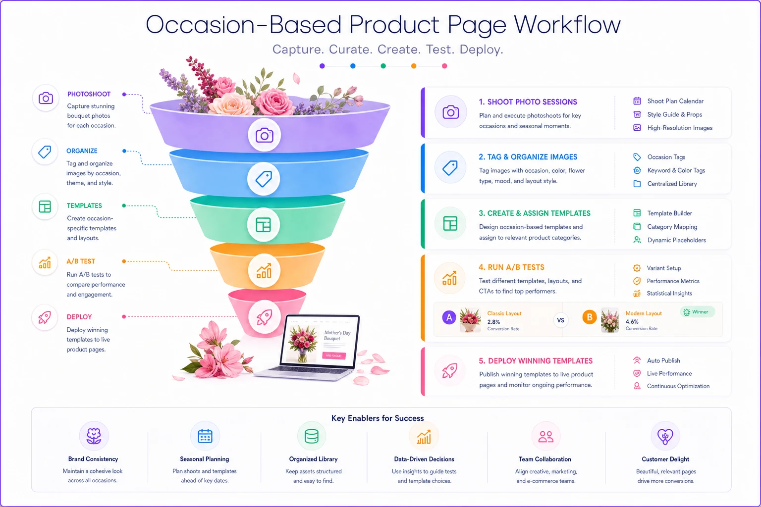
Your occasion templates should pull from the same inventory data but display it differently. Birthday pages might highlight colorful mixed bouquets from your standard inventory, while sympathy pages feature white and pastel options from the exact same stock.
Testing your way to the right template mix
Finding your optimal floral product page template mix requires systematic testing, not guesswork. Start by benchmarking current performance by occasion type.
Phase 1 testing (weeks 1-4): Pick your highest-traffic occasion and test hero image context versus standard product shots. Just this one change. Measure conversion rate, average order value, and cart abandonment.
Phase 2 testing (weeks 5-8): Add occasion-specific copy to your winner from Phase 1. Test emotional triggers versus feature-focused descriptions. Birthday pages might test "Make them smile all week" against "Seven-day vase life guarantee."
Phase 3 testing (weeks 9-12): Test delivery presentation. For same-day heavy occasions, test prominent delivery badges versus standard placement. For plan-ahead occasions, test calendar widgets versus dropdown selectors.
The compounding effect becomes obvious after running through these phases. A Denver shop saw conversions increase from 3.4% to 7.2% after three months of systematic occasion-based testing. Same products, same traffic source, dramatically different results.
Document everything in a simple spreadsheet: test date, variant description, results, and winner implementation date. This becomes your playbook for seasonal updates and new product launches.
When AI-powered operations make template management scalable
Managing multiple templates, occasion-specific copy, and systematic testing eventually overwhelms manual processes. This is where operational software with AI automation becomes genuinely valuable—not as a magic solution, but as a tool that makes proven tactics scalable.
AI automation helps by automatically categorizing products by occasion based on your rules, then applying the right template. Instead of manually updating hundreds of product pages, you update occasion templates and let the system propagate changes. This connects naturally to production workflows since occasion types often determine assembly complexity.
The real value comes from testing velocity. AI-assisted platforms can run multiple A/B tests simultaneously across different occasions, automatically identifying winning variants and implementing them. What used to take months of manual testing happens in weeks with clear statistical significance.
Copy generation becomes consistent yet varied. Instead of writing unique descriptions for every birthday arrangement, you define emotional triggers and key phrases, then let AI automation create variations that maintain your brand voice while avoiding repetitive language that kills SEO.
Image tagging and organization happens automatically. Upload your photo shoots and the system recognizes occasion contexts, creating the right associations without manual categorization.
The conversion impact justifies the investment. Shops using AI-powered operational software for template management typically see 20-30% improvement in overall conversion rates within six months. Not from the AI itself, but from making occasion-based optimization actually manageable at scale.
Ready to grow your flower shop business?
Join 500+ flower shops using Blomsly to save time, reduce errors, and delight customers with fresh blooms.